A well-known Python library for producing interactive, animated, and static visualizations in a range of formats is called Matplotlib. It is appropriate for a variety of data visualization jobs since it offers an extensive and adaptable collection of charting capabilities. It is important because of a few main reasons. Easy to Use: Matplotlib offers a straightforward and user-friendly interface for making a large range of plots and charts. Since the syntax is simple, both novice and seasoned coders can understand it.
Versatility: A wide variety of plot types, including as line plots, scatter plots, bar plots, pie charts, histograms, and more, are supported by Matplotlib. Because of its adaptability, users can produce almost any type of interactive, animated, or static graphic. Publication-Quality Plots: Matplotlib is made to produce plots that are suitable for publication. For scientists, researchers, and analysts who have to clearly and aesthetically communicate their findings, this is essential.
To install matplotlib library , execute the following code:
pip install matplotlib
The manager called an analyst robot and asked him to give a report -Year vs Volume- based on the data. The Datasheet is attached herewith. To access the CSV file, click here: https://drive.google.com/file/d/11VY93C6fKN1Jxm33-ti1O-sT0aza2l8D/view?usp=sharing
The analyst robot decided to draw the graphs in two different ways and give them to the manager. First way, bar graph and second way, scatter plot.
# Bar graph report: Program Begins Here.
import matplotlib.pyplot as plt
import pandas as pd
import seaborn as sns
# Load data from the CSV file
file_path = 'ext_list_Novembertions.csv'
data = pd.read_csv('D:\Education Content-2\Apple\Books\pyhthon folder\ext_list_Novembertions.csv')
# To know the file details, show the first 4 or 5 rows of the data.
print(data.head())
# Create a bar plot
plt.bar(data['Year'], data['Volume'])
# Add labels and title
plt.xlabel('Year')
plt.ylabel('Volume')
plt.title('Bar Chart using CSV file')
# show the chart.
plt.show()
Output
Sourcerecord ID Source Title (newly added titles are highlighted in red) \
0 19700182619 Academic Journal of Cancer Research
1 19300157018 Academy of Accounting and Financial Studies Jo...
2 19700175174 Academy of Entrepreneurship Journal
3 19700175175 Academy of Marketing Studies Journal
4 19700175176 Academy of Strategic Management Journal
Print-ISSN E-ISSN Publisher \
0 19958943 NaN International Digital Organization for Scienti...
1 10963685 NaN Allied Business Academies
2 10879595 15282686.0 Allied Business Academies
3 10956298 15282678.0 Allied Academies
4 15441458 19396104.0 Allied Business Academies
Reason for discontinuation Year Volume Issue Page range
0 Publication Concerns 2013 6 2 84-89
1 Publication Concerns 2021 25 6 001-020
2 Publication Concerns 2024 27 5 001-021
3 Publication Concerns 2016 20 3 73-88
4 Publication Concerns 2025 20 5 001-024

# Scatter graph report: Program Begins Here.
import matplotlib.pyplot as plt
import pandas as pd
import seaborn as sns
# Load data from the CSV file
file_path = 'ext_list_Novembertions.csv'
data = pd.read_csv('D:\Education Content-2\Apple\Books\pyhthon folder\ext_list_Novembertions.csv')
# Create a Scatter plot
plt.scatter(data['Year'], data['Volume'])
# Add labels and title
plt.xlabel('Year')
plt.ylabel('Volume')
plt.title('scatter Chart using CSV data')
# Display the scatter plot
plt.show()
OUTPUT:

#Scatter plot can be drawn normally without CSV file see below example.
import matplotlib.pyplot as plt
import numpy as np
# Produce arbitrary information for the scatter plot.
np.random.seed(42)
#seed means what? Setting the random number generator's seed in Python, notably when utilizing the NumPy library (np is a frequent alias for NumPy), is done with the np.random.seed(42) line. This holds implications for reproducible random number generation.
#More specifically, this means: Creating Random Numbers: Although the numbers produced by #computers seem random, algorithms are frequently used to generate them.
#A seed is the initial value used by these algorithms; if you use the same seed, the sequence of "random" numbers will be the same.
Replicability: You may make sure that you get the same random number sequence each time you run your program by setting the seed to a specific value, in this example 42.
x_values = np.random.rand(50)
#total number of random x values is 50.
y_values = 2 * x_values + 1 + 0.1 * np.random.randn(50)
# y values are chosen.
print(x_values)
print(y_values)
# to draw scatter plot
plt.scatter(x_values, y_values, label='Scatter Plot', color='blue', marker='o')
# for adding title and label
plt.xlabel('X-axis')
plt.ylabel('Y-axis')
plt.title('Here the scatter plot')
# To add a legend
plt.legend()
# show the scatterplot
plt.show()
OUTPUT :
[0.37454012 0.95071431 0.73199394 0.59865848 0.15601864 0.15599452
0.05808361 0.86617615 0.60111501 0.70807258 0.02058449 0.96990985
0.83244264 0.21233911 0.18182497 0.18340451 0.30424224 0.52475643
0.43194502 0.29122914 0.61185289 0.13949386 0.29214465 0.36636184
0.45606998 0.78517596 0.19967378 0.51423444 0.59241457 0.04645041
0.60754485 0.17052412 0.06505159 0.94888554 0.96563203 0.80839735
0.30461377 0.09767211 0.68423303 0.44015249 0.12203823 0.49517691
0.03438852 0.9093204 0.25877998 0.66252228 0.31171108 0.52006802
0.54671028 0.18485446]
[1.8229269 2.91856544 2.45242306 2.1672066 1.16418508 1.24000462
1.07010335 2.83806451 2.23659185 2.23984114 1.07357739 2.90131148
2.59719308 1.48584585 1.46674989 1.45993703 1.52456273 2.01859163
1.89701638 1.68001279 2.17578837 1.26042182 1.4736558 1.61310302
1.99339255 2.70597593 1.39214655 2.12882217 2.22099274 1.02838885
2.25122926 1.4948519 1.12652058 3.05423544 2.66928956 2.69898495
1.61793225 1.16544349 2.37764213 1.6815481 1.22210928 2.02606508
1.21656645 2.76681378 1.4367106 2.27486886 1.71496236 2.07301115
2.04044454 1.42103565]
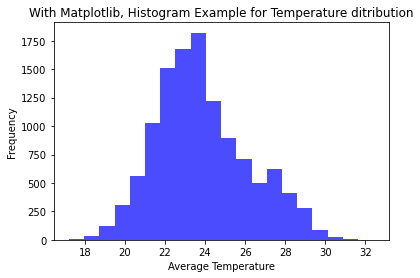
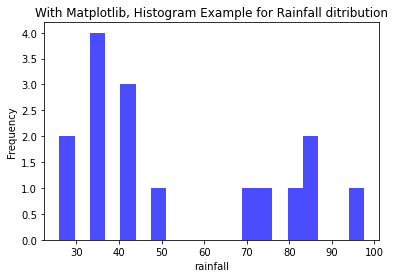
HISTOGRAMLarge datasets that reflect measurements, observations, or simulation results are frequently worked with by engineers. Histograms give engineers a visual depiction of the data distribution, assisting them in recognizing underlying trends and patterns. The frequency of various events or values within a dataset is shown via histograms. Finding trends and anomalies is important for engineers since it helps them concentrate on areas that could need maintenance or additional research. The manager currently provides two CSV files and wants to retrieve the following information from the analyst robot. Analyst Robot takes the effort to do so. To get these files: https://drive.google.com/drive/folders/1O6OFRmHvCEP6KmFDUlEOTuKBAth0K4ao?usp=sharing In the first CSV file, calculate the temperature of a city, and visualize how the temperature of that city has varied over the last 10 years. In the second CSV file, it needs to calculate how much rainfall has been in that city over the last few years. Analyst Robot uses the Instagram tool to calculate the minimum and maximum values of only one piece of data in these two CSV files, temperature and rainfall. The following example illustrates the answer.#Histogram Example for Temperature ditribution import pandas as pd import matplotlib.pyplot as plt import seaborn as sns # Load data from a CSV file. file_path = 'Rajasthan_1990_2022_Jodhpur.csv' dfram = pd.read_csv('D:\Education Content-2\Apple\Books\pyhthon folder\Rajasthan_1990_2022_Jodhpur.csv') # retrive the values column from the csv file tavg = dfram['tavg'] # Using Matplotlib plt.hist(tavg, bins=20, color='blue', alpha=0.7) # Add labels and title plt.xlabel('Average Temperature') plt.ylabel('Frequency') plt.title('With Matplotlib, Histogram Example for Temperature distribution') #display the plot plt.show()OUTPUT:#Histogram Example for Rainfall ditributionimport pandas as pdimport matplotlib.pyplot as pltimport seaborn as sns# Load data from a CSV file.file_path = 'Rajasthan_1990_2022_Jodhpur.csv'dfram = pd.read_csv('D:\Education Content-2\Apple\Books\pyhhon folder\district wise rainfall normal1.csv')# retrive the values column from the csv fileJAN = dfram['JAN']# Using Matplotlibplt.hist(JAN, bins=20, color='blue', alpha=0.7)# Add labels and titleplt.xlabel('rainfall')plt.ylabel('Frequency')plt.title('With Matplotlib, Histogram Example for Rainfall distribution')#display the plotplt.show()OUTPUT:

.png)
.png)
No comments:
Post a Comment